
Pantone, the Kings of Colour
- Melissa McMahon

- May 16, 2018
- 2 min read
Just about everyone has heard of Pantone. They are the folks who literally wrote the book on colour. It started in 1963, when Lawrence Herbert concocted a plan to systematise colour, by identifying the exact ink formula for every colour, tint and shade. This consistent recipe for each colour ensured that it was the same, in spite of changing light or other physical conditions.
You see, colour perception can be a tricky thing. There are a myriad of elements that can interfere with the way a colour is perceived, from the surface they are on, be it fabric, wall or paper, to the environment they are in. Even our own observation of the colours we see can skew our view. People with colour blindness see colour in a very different way to the rest of the world. This means that two people looking at the same sunset could have a very different mental image of what is before them. This colour system allow professionals, across multiple disciplines, to specify a colour by code and get it right every time.
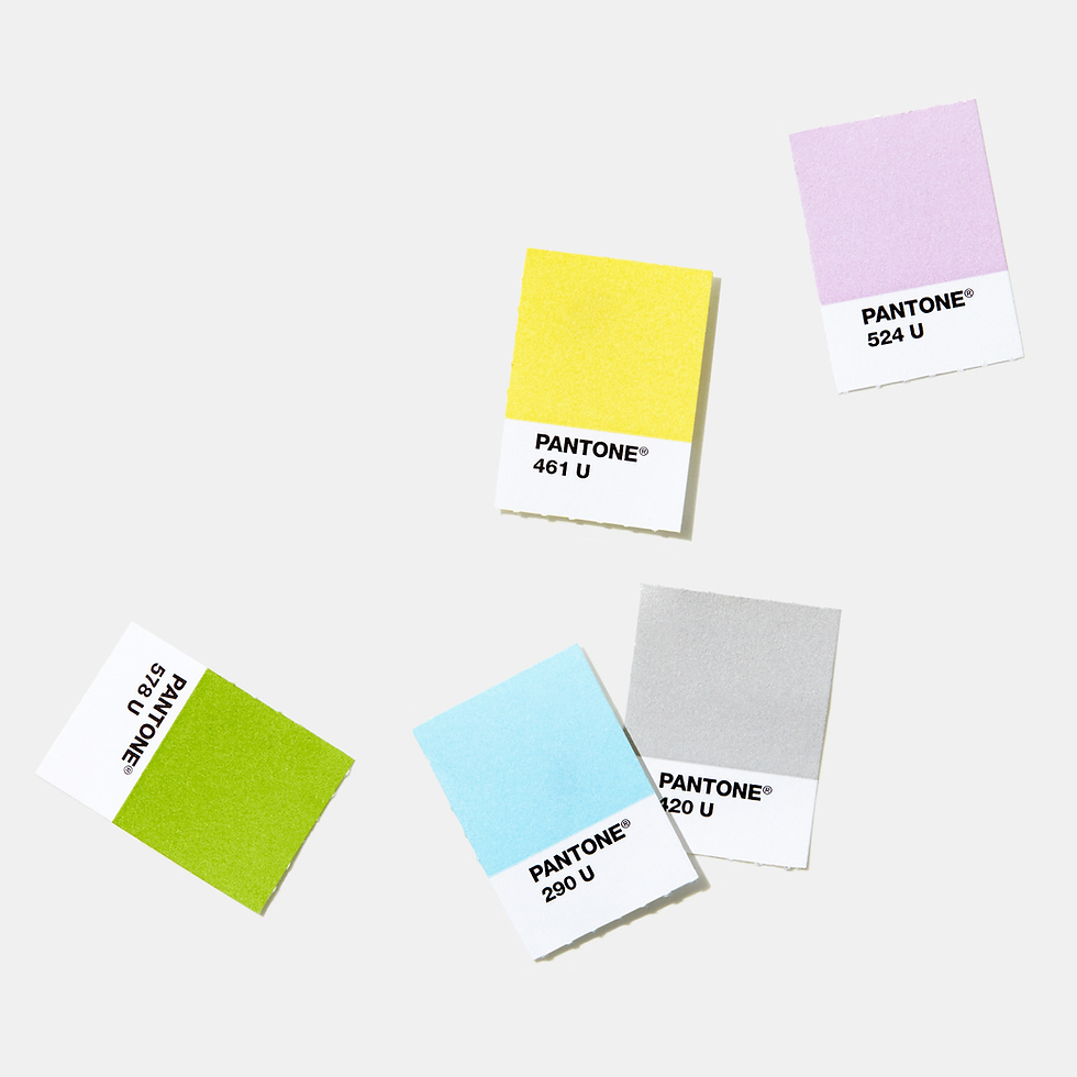
The Pantone chip then, was the first means of creating a brand for the company, outside of the world of designers and creatives. The chip, with its bold block of colour on top and white strip below containing the colour code, has become immediately recognisable as a product of the New Jersey based company. Just a quick search for “pantone products” on the web will show the plethora of products that the chips likeness is emblazoned on, from iPhone cases to towels.

Then in 2000 the Pantone Colour Institute launched the Pantone Colour of the Year. This was a movement towards creating a trendsetting model for creative society as a whole. Since then, the colour of the year has gone on to be celebrated in publications such as Vogue and Elle each year when it is announced in December. It has moved from being a tool for designers to also being a news story for the general public.
The institute selects the colour by studying everything from fashion, social media to politics and the colour chosen has become increasingly influential in the world of design and marketing. Brands now design whole ranges based on the colour of the year. The colour chosen for 2018 was Ultra Violet. It was said to “suggest the mysteries of the cosmos, the intrigue of what lies ahead, and the discoveries beyond where we are now”. This choice was made as a nod towards the strives we are making towards reaching out beyond the confines of earth, just as Pantone reached beyond the confines of the colour chart.


Comments